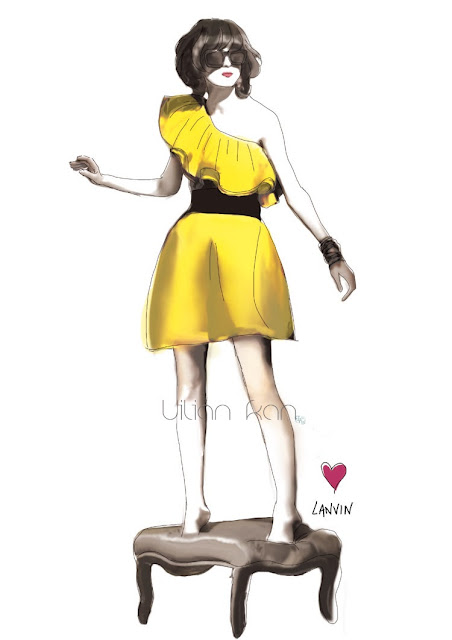
Inspirations can come anytime, anywhere from anything.
It can be either tangible or intangible.
A single idea, a picture, a mood or even a smile of a mysterious women.
Rather than just sharing my illustrations,
I would like to share something more in-depth when it comes to design and drawings...
in which I seldom had chance to talk with my friends because they are probably not interested nor will they understand what am i talking about,
let alone my parents.
Most of the time my mind runs a lot faster than my mouth,
and so most of the time I cannot fully describe what is really on my mind,
So I occasionally speaks very less or just stay silent.
Because at that status, I can't catch the fast-forward ideas all over my mind.
it is not like I had any difficulties in explaining things but then it's just word can not
describe the complicated situation happening.
I spend most of my time thinking, I seldom leave my mind blank,
I always ponder, explains and finds the answer of different things,
which I would like to tell you from time to time.
If you want me to talk about fashion, design , art and beauty,
I can talk for whole day long, from Gustav Klimt to Coco Chanel,
Le Corbusier to Philip Stark, but then time is limited.
So, today I am just going to talk about Colour.
The first thing I do when I starts my illustrations is finding a colour palette for it.
Colour is something very interesting, without light, there will be no colour,
so I always think the designers which used to use grey scale are always under the mood of depressed,
which no light goes into their life.
There are hue, lightness and saturation in colour, and changing either one of it can lead to
whole new different mood.
I am going to show how do I get my colour inspirations from a single picture.
Of cause it can be a several pictures but I am going to make it easier to understand.
for example, when I see a picture like the below one,
Retrieved from acreativemint.typepad.com
the above would be the colour palette I got inspired from the picture.
most of the time we need to find out the pantone number to be more professional
and I always give them delicious names.
For instance, the left one I would name it ' Frosty Snow '.
It is not just useful for fashion designers or illustrators, it is also a very
important practice for photographers. Beautiful photographs always consist of
harmonically combined colour.
And remember, there is no such thing as an ugly colour,
there is just something called an ugly colour combination.
There is even a formula for it called The Müller Formula .
It is so so interesting, isn't it?
Tell me I'm right.


